Case STUDY:
Project type:
Peas and Hoppiness
- brand identity, web design
- Fort Collins, Colorado
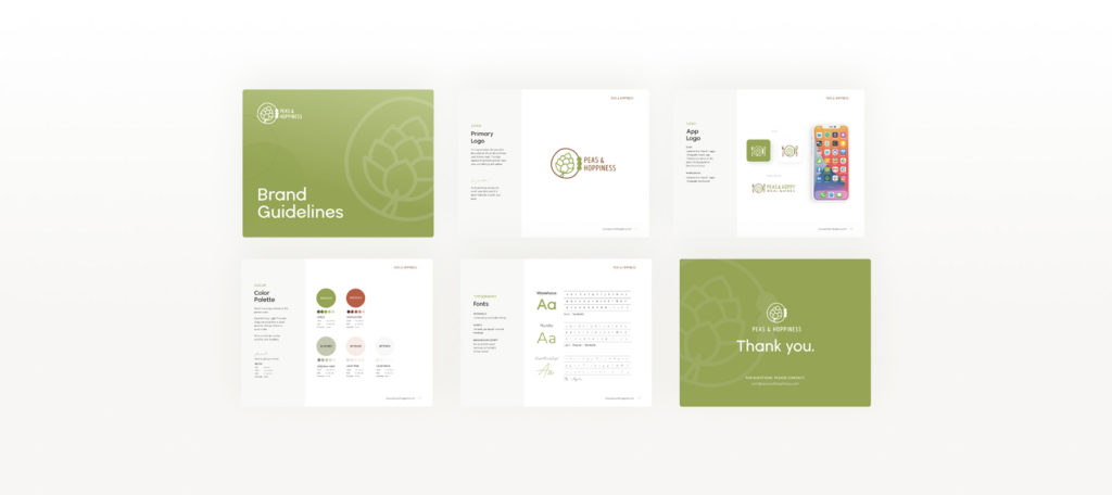
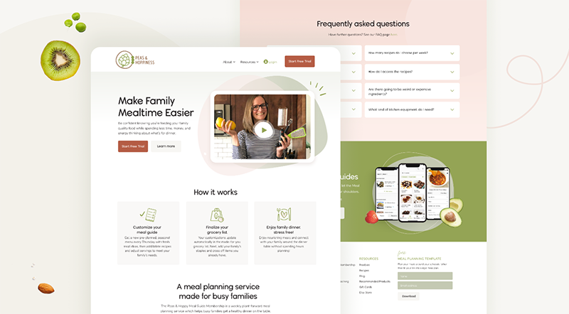
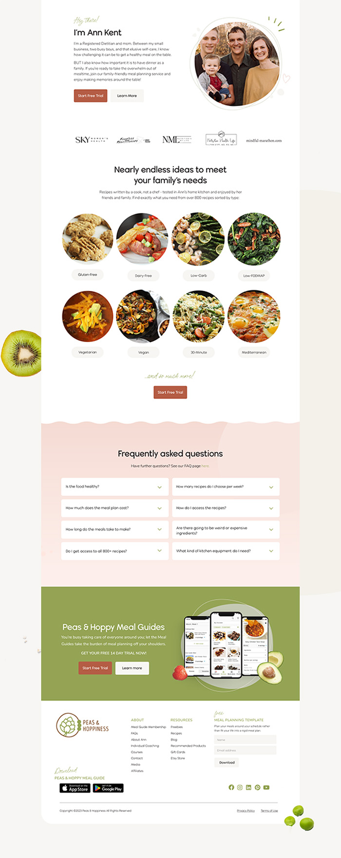
Peas & Hoppiness was operating on many disconnected platforms and wanted to streamline their process, improve their webpage design (particularly for recipes), as well as have a brand identity they could replicate, appear professional, fun and modern.
In addition, they required a logo for their app which just launched.
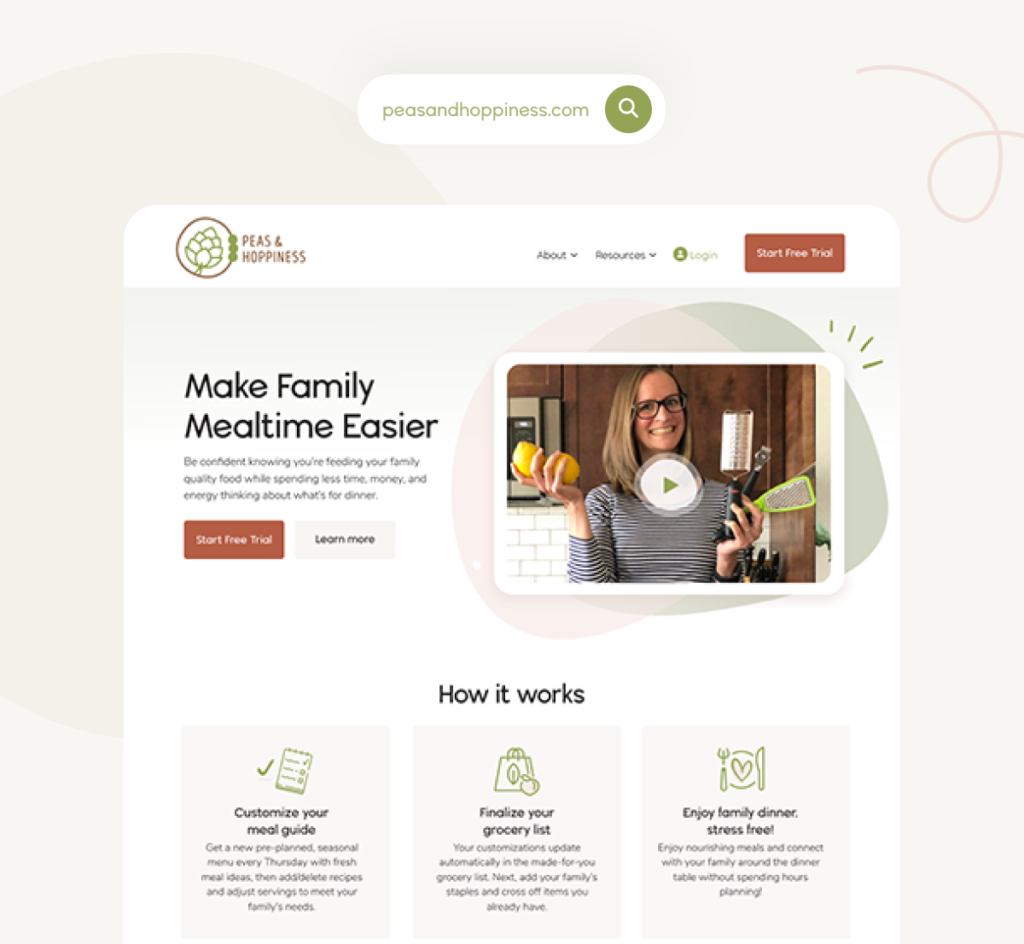
Overall, the new brand has a quirky, fresh feel but maintains a feminine appearance to appeal to their target audience: busy moms.
We stayed with the original green to maintain brand recognition but dropped dark browns and muddy colors in order to lighten things up.
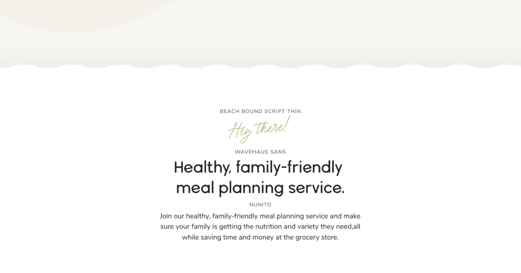
The fonts are a combination of sans-serif and script font which is fun and playful yet modern. Nunito font, in particular, has high usability across platforms including Canva, Google, MS Word, iOS and Android apps.
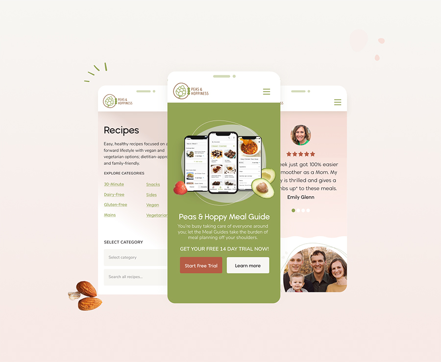
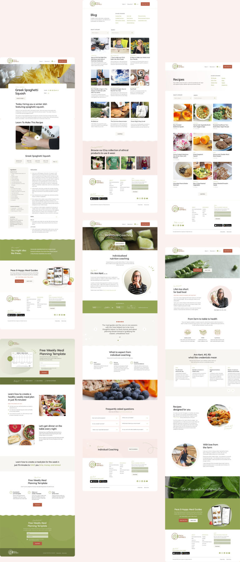
Now, the webpages have improved UX design and readability including more organized layouts with filters, tags and drop-down menus for recipes and products. The new site has a strong CTA button throughout the site: Start Free Trial.
DESIGN:
DEVELOPMENT:
DELIVERABLES:
- Brand Guidelines
- Homepage, About, Recipes, Blog, Consultation and Landing Page
- App Logo Design
- Fonts & Color Palette
- Mobile Design
- Wireframes
- Hover & Interaction effects

Nicole has such an incredible eye for design and colors! Nicole was also so wonderful to work with. She truly cared about creating a product that was right for me, taking time to listen to the goals for my business and the feeling I was trying to convey. I LOVE how my new website turned out – highly recommend!!

