
Introduction
Print design is an important part of visual communication, whether you’re working on flyers, brochures, posters, or banners. Many new designers make common graphic design mistakes, leading to problems like blurry images, misaligned text, or the need for costly reprints. If you’re a graphic designer aiming to create professional, high-quality designs, understanding these mistakes and knowing how to avoid them is key. In this article, we’ll explore five of the most common print design mistakes, explain their consequences, and show you how to avoid them.

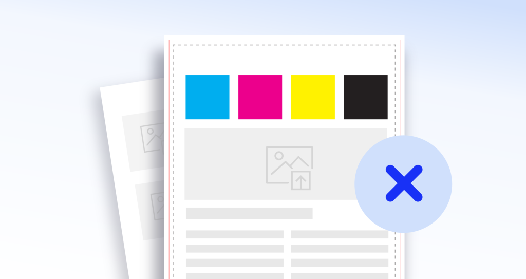
1. Ignoring Bleed
Mistake:
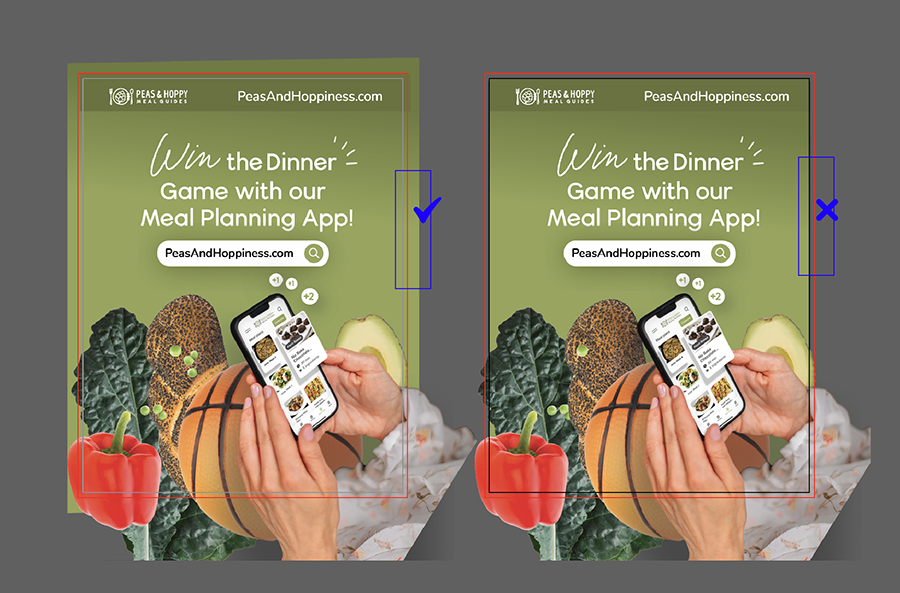
A frequent error in print design is forgetting to include a bleed in your design. Bleed refers to the extra space around the edges of your artwork that ensures no unwanted white borders appear when the design is trimmed after printing.
Consequences:
If you don’t account for bleed, you might end up with a thin white line around your printed material, making it look sloppy and unprofessional. For example, if you’re designing a flyer in programs like Illustrator or Photoshop, forgetting to add bleed can lead to parts of your design being cut off or leaving unwanted gaps around the edges.
Solution:
Always add a bleed when setting up your document before you begin designing. A common bleed size is 3mm (0.125 inches). Most design programs, including Illustrator and Photoshop, allow you to add this setting when creating a new file. This ensures that your design elements extend beyond the edges so that everything looks sharp and clean after trimming.
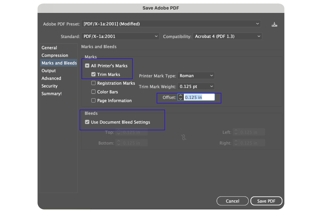
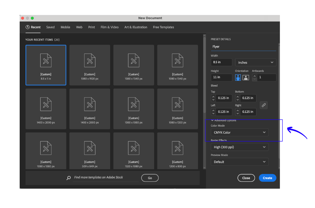
In Illustrator, on set up, add in your bleed as .125 inches. When done and ready to save to PDF, select Marks & Bleeds, and check off Trim Marks and set the offset to .125in. Also, check off Use Document Bleed Settings. These options will give your printer guidelines for where to cut the paper in your file.
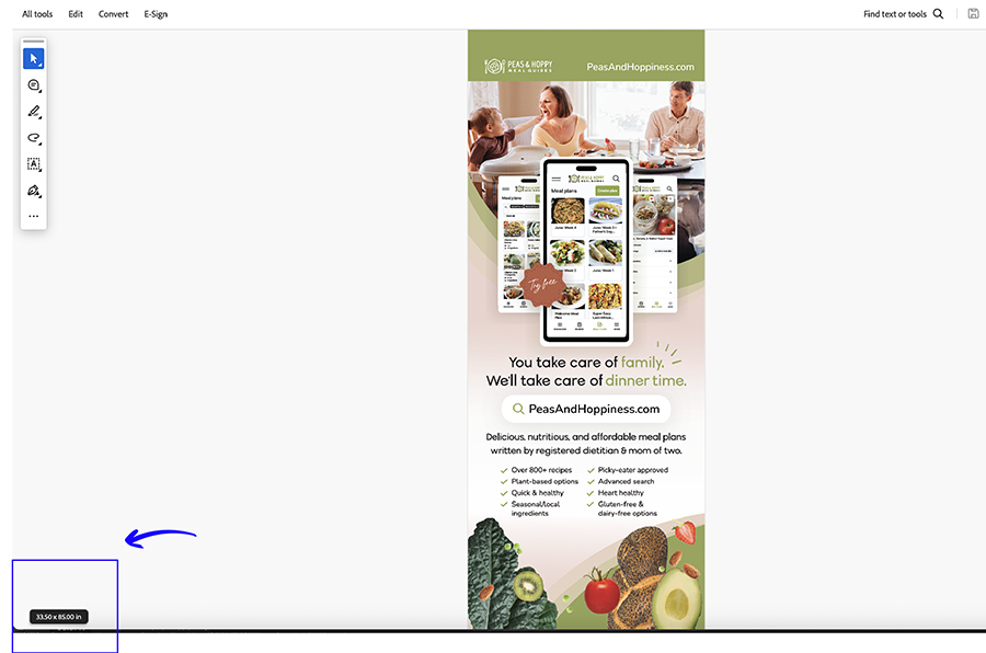
On Export, open the PDF. On the bottom left hand side, hover your mouse and a small box appears that tells you the total size of your document in width x height as well as the bleed. This is a good way to ensure the .125 inches of bleed was included in your export.
2. Designing in RGB Instead of CMYK
Mistake:
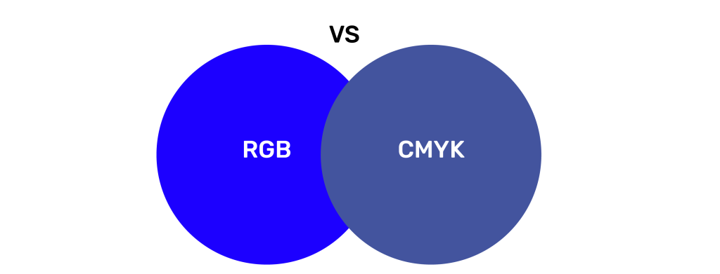
Designers sometimes start a project in RGB colour mode, which is meant for screens and digital media, rather than CMYK colour mode, which is used for print.
Consequences:
When you design in RGB and then print, colours can look dull or washed out. This happens because RGB (Red, Green, Blue) and CMYK (Cyan, Magenta, Yellow, Black) represent colours differently. For instance, a bright blue on your computer screen may appear as a muted shade once printed.
Solution:
From the beginning, always set your document colour mode to CMYK if your design is going to be printed. When in both Illustrator and Photoshop, you can change the colour mode in the document settings. However, starting with CMYK ensures that your colours will look right when printed. Converting from RGB to CMYK later in the design process can cause unexpected colour shifts, so it’s best to always start with CMYK from the beginning.
In addition, your images you add to your file, needs to be in CMYK mode as well. To change your images to CMYK, open them in Photoshop and goto Image -> Mode -> CMYK Color. After, save and export the new images.
3. Confusing Spot Colours and Global Colours
Mistake:
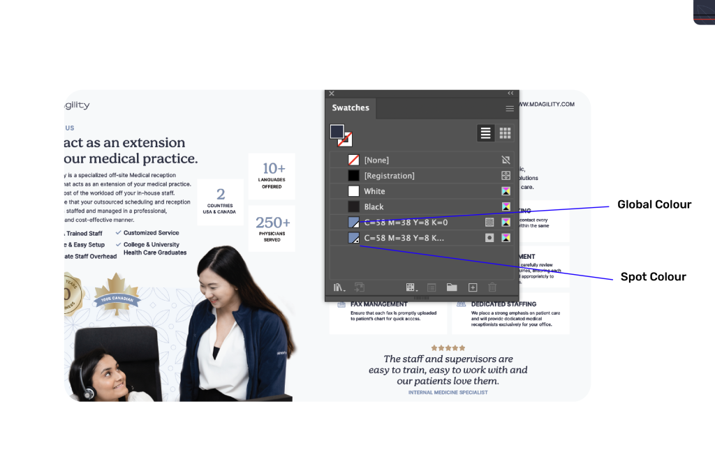
Other common print mistakes is not understanding the difference between Spot Colours and Global Colours when preparing a design for print. This can result in unexpected colour variations. Junior designers might mistakingly use one instead of the other and vice versa.
Global Colours are colours you create for consistency across the whole design, which is especially useful for large-scale projects. If you change the global colour, every part of your design that uses that colour will update automatically. This is very useful when creating colours for example, changing an accent colour to see how the rest of the colour palette would look together.
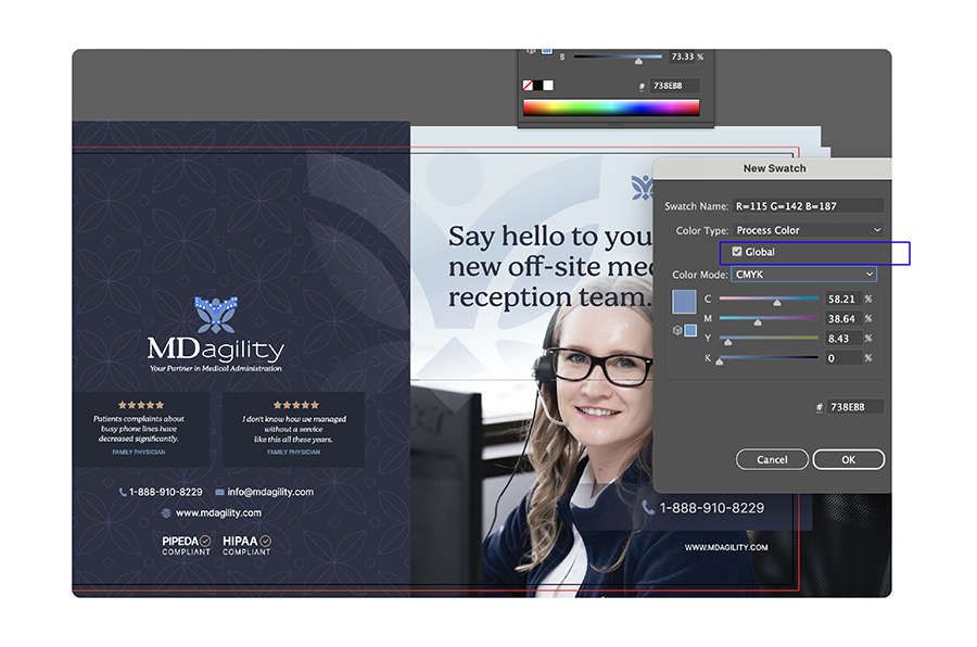
Spot Colours, on the other hand, are premixed inks used for exact colour matching. They’re standardized set of colours (like the Pantone colour library for example) and are perfect for projects where specific colours, like logos, need to match exactly. The benefit of using spot colours is that it ensures the colour will print accurately. Talk to your printer about which colour system works best for your project.
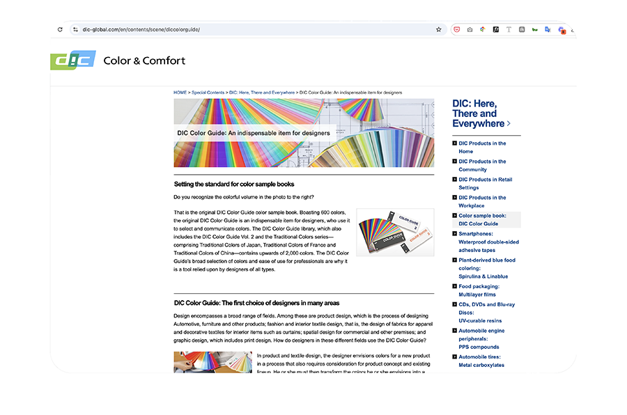
DIC COLOR GUIDE Spot Colors Link: https://www.dic-global.com/en/contents/scene/diccolorguide/
It can be pretty easy to confuse the two since they are both identifiable by a dot in Illustrator and Photoshop.
Consequences:
If you’re printing a large quantity, like banners or brochures, and you’re using colours incorrectly, the final printed version might have different shades of the same colour. This is a huge problem, especially for branding materials where colour consistency is critical.
Solution:
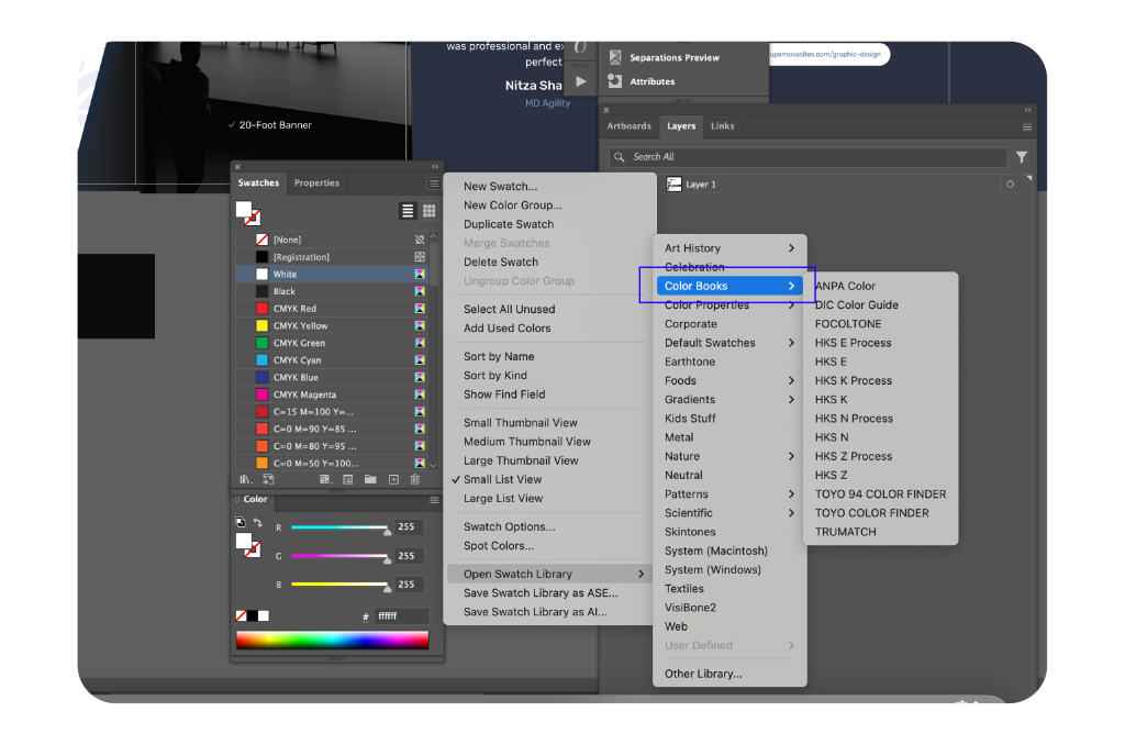
In Illustrator, always check your colour swatches before sending your design to the printer.
YOUTUBE
How to Convert a Color png Logo into Black or White
This video explains the process of converting a logo to black or white with Photoshop.
4. Using PNG Files for Print
Mistake:
Many new designers use PNG files for print design, which is a mistake because PNGs are optimized for digital use, not printing. PNGs are not ideal for printing because printers print in CMYK colour mode not RGB, so the printer will not be able to fully optimize the colours in the PNG.
Consequences:
Since PNG files are typically lower in resolution and use RGB colour mode, printing them can lead to blurry or pixelated images, as well as colour inaccuracies. For example, if you’re creating a large banner or a high-quality flyer, using PNG files could result in a poor-quality print. You might even notice an off coloured box surrounding the png once printed. This can be particularly exacerbated if their is CMYK files placed below the PNG.
Solution:
Instead of PNGs, use file formats like TIFF, JPEG, or EPS for print. TIFF files are ideal because they support high resolutions and can retain layers and transparency and supports both CMYK and RBG colour spaces.
5. Not Exporting PDFs Correctly
Mistake:
Another frequent mistake is exporting designs as PDFs in the wrong size or with the wrong settings, which can lead to issues in the final print.
Consequences:
If you export a PDF with incorrect dimensions or settings, parts of your design might get cut off, or it might not fit properly on the page. For example, if you’re designing a conference banner and don’t export it to match the exact banner size, the result could be an image that doesn’t align correctly when printed.
Solution:
Before exporting your design, double-check the document size and use the correct settings. Programs like Illustrator and Photoshop have print-ready presets that ensure the PDF is exported with the correct resolution, colour profile (CMYK), and bleed settings. After exporting, use Adobe Acrobat to review the PDF and ensure that everything, including the bleed and crop marks, looks perfect before sending it to the printer.
How to Export PDFs in Adobe Illustrator:
Here are some good practices to take when exporting PDFs in Adobe Illustrator:
Go to File -> Export -> Export As ->Select High Quality Print in order to keep your images and objects at 300 DPI.
Second, go to Marks & Bleeds and check off Trim Marks and change the offset to .125in. Also check off Use Document Bleed Settings. These options will give your printer guidelines for where to cut the paper in your file.
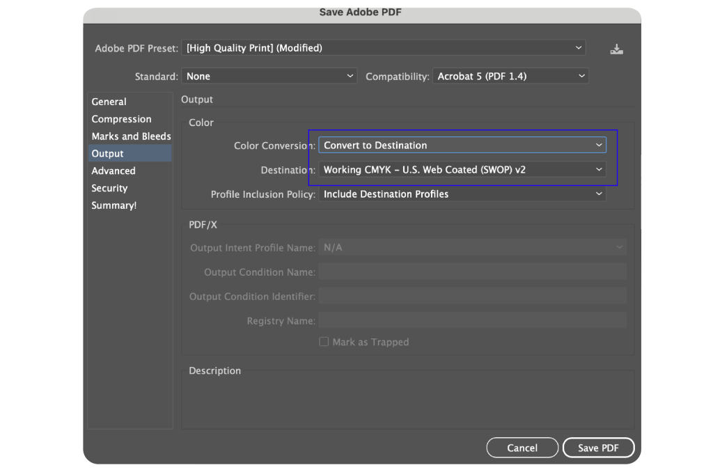
Third, go to Output and Select Color Conversion drop down and Convert To Destination selecting Working CMYK – U.S. Web Coated (SWOP) v2. This is helpful as it ensures all the colour will be in CMYK ready for print.
6. Not Resizing Photos Correctly
Mistake:
Resizing images improperly, especially when they’re too small than what is required, is another common problem. Designers sometimes stretch or shrink photos without maintaining the aspect ratio, leading to distorted or pixelated images.
Consequences:
If you stretch an image that is too small for the design, it will appear pixelated and blurry in the final print. For instance, if you’re working on a conference banner that is 33 inches wide and the photo you’re using is only 10 inches wide, stretching it will result in poor quality. This makes the banner look unprofessional such as pixelated and blurry when printed. It’s sometimes not obvious that an image is pixelated until later once the design is printed so ensure it is correct before sending to the printer beforehand.
Solution:
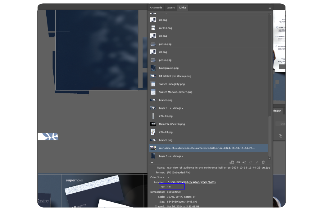
Always use high-resolution images for print design. Before adding in new images, check the properties of an image first including image size (e.g. 2832 × 2832) and PPI (e.g. 75, 200, or 300 PPI) by right clicking on it and selecting Properties or Get Info.
In Photoshop, you can also goto Image -> Image Size to find this information on your images properties.
In Illustrator, if you go to Windows –> Links and select an image, it will give you a break down on the information on the photo including image size and PPI.
When working with images for print, always aim for a resolution of at least 300 DPI (Dots Per Inch) to ensure sharp, clear print quality. In contrast, web images typically have a resolution of 72 DPI, which isn’t sufficient for print.
Once uploading an image, to resize it, ensure to hold the Shift key in Illustrator to maintain the image’s aspect ratio. In Photoshop, you do not need to hold down the Shift key as the software will resize it’s aspect ratio by default.
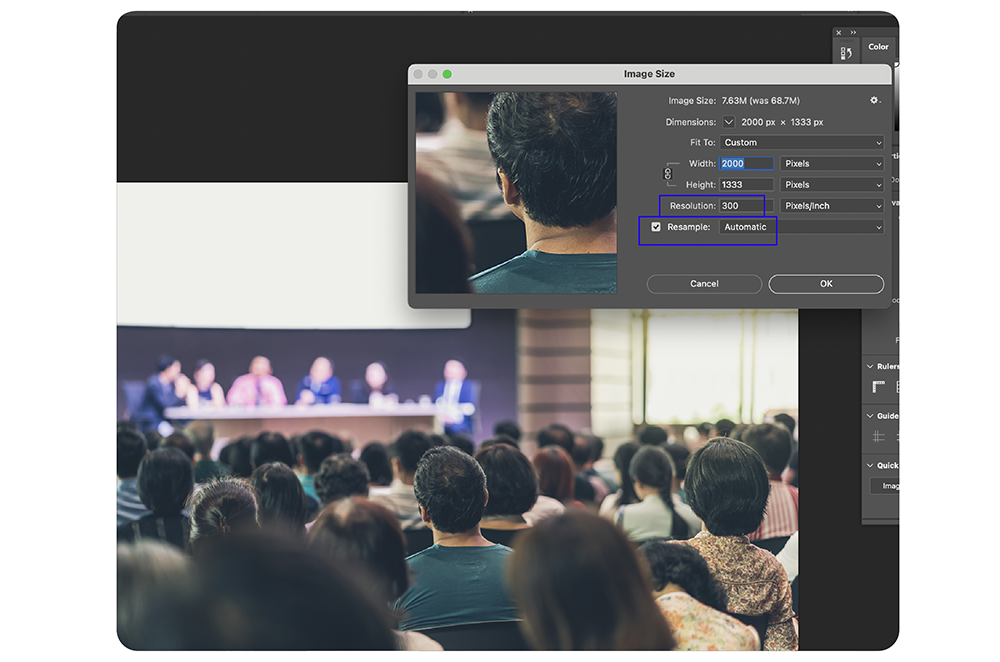
If you don’t have a large enough image for your design, there is a work-around using Photoshop’s Image Size tool. This handy tool allows you to resample the image to fit your design without sacrificing too much quality. Go to Image -> Image Size, enter the new image size dimensions you need in width and height, and set the resolution to 300 PPI (Pixels/Inch), and checking the Resample options to help maintain image sharpness. Often times, the Automatic option for Resample should work but try all the other Resample options to see what works best for your image.
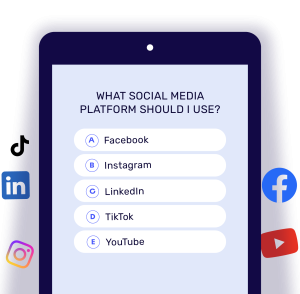
Which Social Media Platform Should You Use?
Don’t want to waste time and money on the wrong platform Take the quiz and find out the right social media platform for you. Take quiz.
Final Steps: Double-Check in Adobe Acrobat
Mistake:
Sometimes designers forget to thoroughly check the final exported PDF before sending it to the printer. This can lead to unnoticed problems, like missing fonts, color issues, or alignment problems.
Consequences:
If the PDF is flawed, you risk the entire print job, potentially resulting in costly reprints or delays. For example, imagine designing a detailed brochure, only to find out after printing that the fonts didn’t embed correctly, leaving gaps or default font replacements.
Solution:
Before sending your design to the printer, open the final PDF in Adobe Acrobat and review it carefully. Check for bleed, crop marks, and ensure the fonts are embedded and images are high-resolution. Acrobat also allows you to check the file for proper colour profiles and other print settings. This extra step can save you a lot of trouble down the line.
In addition, in Adobe Acrobat, you can use the Preflight tool to evaluate any possible issues with your document.
To access it, goto All Tools on left hand side -> Print Production -> Preflight. Choose Essentials at the top and Analyze to see your Preflight report.
Additional FAQs on Print Design
A TIFF (Tagged Image File Format) is a high-quality image file ideal for print because it supports large file sizes, high resolution, layers, and transparency. Unlike PNGs, TIFFs can handle CMYK color mode, making them perfect for print projects.
DPI (Dots Per Inch) is a measurement used in printing to determine how many dots of ink are printed per inch of the image. Higher DPI means better print quality. The standard for print is 300 DPI.
PPI (Pixels Per Inch) is used in digital screens to measure how many pixels fit into an inch. While important for web design, PPI is not relevant for print quality.
Yes, just make sure your color swatches are set to CMYK colour mode.
PNG files are optimized for web use, not print. For print projects, use TIFF or JPEG instead. These formats preserve high resolution and ensure colors print accurately.
YOUTUBE
How to Create a Rainbow Logo in Adobe Illustrator
Transfer your logo into rainbow in Adobe Illustrator.
Conclusion
Print design can be tricky, but by avoiding these common mistakes, you can produce professional, high-quality results. Always check bleed settings, use the right color swatches, design in CMYK, choose the right file formats, and review your final export before printing. These steps will help you avoid costly reprints and ensure your design stands out in the best possible way.
Be sure to save this article as a guide for next time you work on a print project!


