
What is the 60-30-10 Colour Rule and How to Apply It in Web Design?
Choosing the right colour palette for your website can be challenging. Too many colours can make a design look chaotic, while too few can make it feel dull. That’s where the 60-30-10 colour rule comes in; a simple yet powerful guideline to create a balanced and visually appealing website.
What is the 60-30-10 Colour Rule?
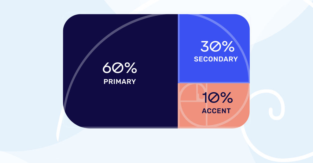
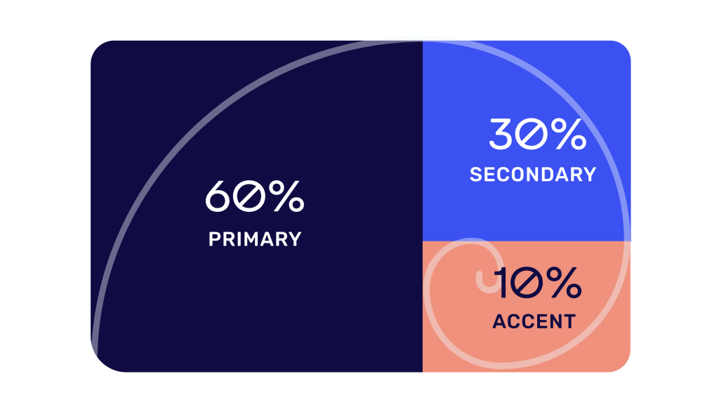
The 60-30-10 colour rule is a classic design principle used in interior design, fashion, and branding. It has also become a go-to strategy for web designers looking to create harmonious colour schemes. The rule breaks down colour usage into three proportions:
- 60% Dominant Colour – This color takes up the majority of the visual space.
- 30% Primary Brand Colour – This is your main brand color (e.g., Starbucks green, Facebook Blue, Spotify green).
- 10% Accent Colour – Adds pops of vibrancy for emphasis.
This structured approach ensures a balanced, professional look while keeping the design engaging.
Why this ratio works so well
This 60-30-10 colour rule works very effectively because it is backed by science with the golden ratio; a mathematical equation. The golden ratio appears in patterns in nature, like spiral arrangement of leaves and other vegetation as well seashells.
You can find the golden ratio applied in architecture, art, design, flags and even music.
How to Apply the 60-30-10 Rule in Web Design
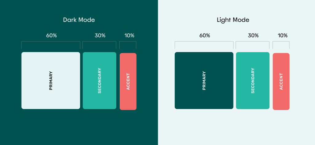
1. 60% Dominant Colour – The Foundation
This is typically a neutral background (egg-shell white, beige, light grey) that allows other colours to stand out. This colour can also be swapped out for a dark-coloured backgrounds such as deep purple, soft black, or gray.
Suggested Uses:
- Website backgrounds
- Main content sections
- Headers and footers
Tip: Soft neutrals prevent visual clutter and improve readability.
2. 30% Primary Brand Colour – The Star of the Show
This is your main brand colour, used strategically to reinforce brand identity. You really want to drive home this colour to your audience.
Suggested Uses:
- Secondary Buttons
- Icons
- Graphic elements
- Navigation bars
- Photo colour treatments
- Backgrounds – at times.
- Headings or subheadings
Tip: Ensure this color has enough contrast against the dominant color for visibility.
3. 10% Accent Colour – The Finishing Touch
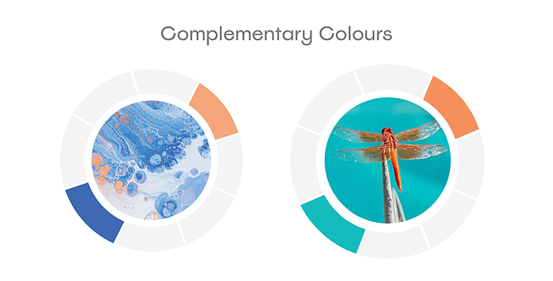
This is where you add bold, eye-catching elements to guide user attention. Often times, the accent colour works best as a complementary colour to your primary colour (e.g. orange to blue, yellow to purple, green to red). You can find the complementary colours on the colour wheel.
Suggested Uses:
- Main Call-To-Action Button
- Interactive buttons
- Hover effects
- Important notifications or badges
- Icons and graphics
Tip: Use this bright or saturated colour sparingly to avoid overwhelming the design.
Examples of the 60-30-10 Rule in Web Design
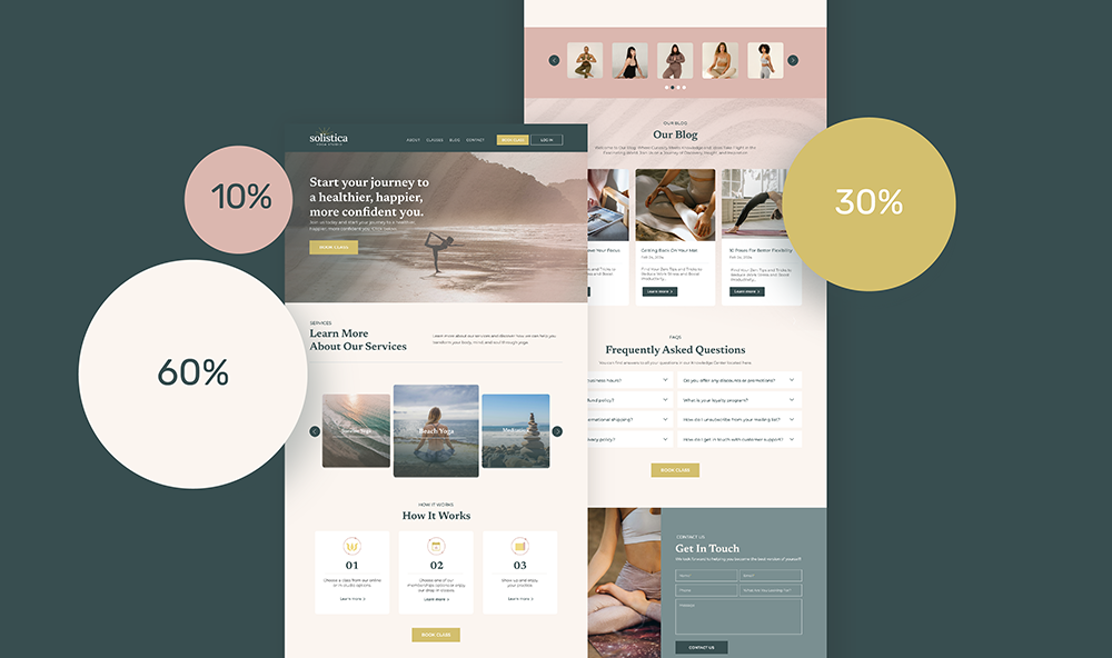
Example 1: Yoga Studio
- 60% Dominant: Seashell Pink (warm, inviting, natural)
- 30% Primary: Metallic Gold (applied in logo represents luxery, warmth, prestige)
- 10% Accent: Dusty Rose
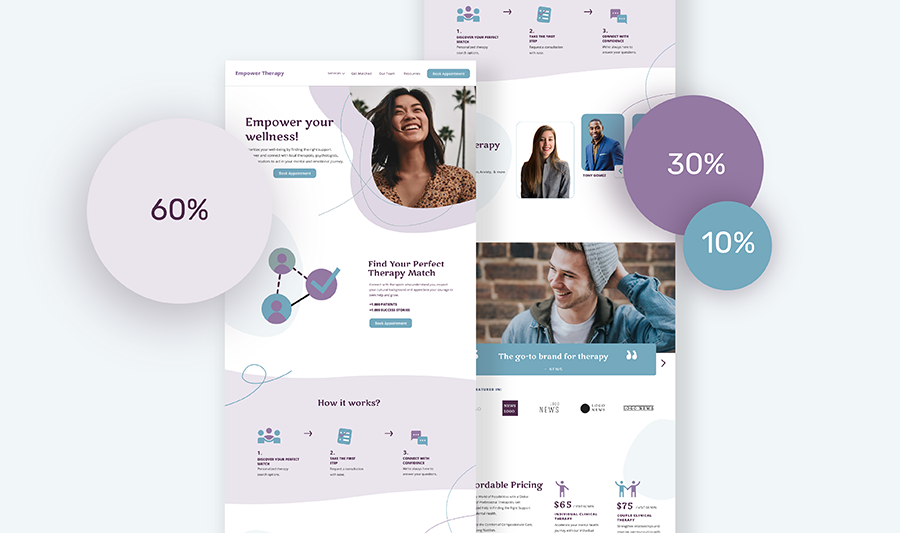
Example 2: Therapist Practitioner
- 60% Dominant: Light Lavender (calming, majestic)
- 30% Primary: Muted Violet
- 10% Accent: Teal Blue
NEWSLETTER
Content useful to you?
Opt-in to get more website tips straight to your inbox.
View our privacy policy to learn more about your data.
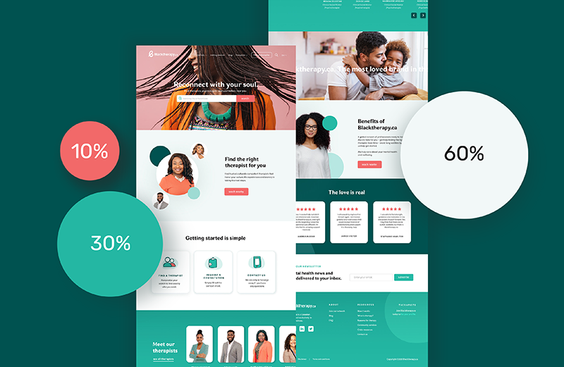
Example 3: Mental Health Agency
- 60% Dominant: Light Aqua
- 30% Primary: Emerald Green
- 10% Accent: Coral Red (eye-catching and creates a lot of contrast as a complimentary to green).
Bonus Tips for Using the 60-30-10 Rule Effectively
- Stay On-Brand – Your primary colour should match your brand identity.
- Test for Accessibility – Ensure text is readable (tools like WebAIM Contrast Checker help).
- Use Tints & Shades – Adjust the brightness for depth without adding extra colours.
- Keep It Simple – Stick to three main colors for a clean, professional look.
- Have fun! – Rules were made to be broken but if you ever get stuck, you can always revert back to this colour rule.
Putting it all-together
The 60-30-10 rule is a foolproof way to create a visually balanced website. By carefully distributing colours, you ensure a polished, professional look that enhances user experience. Try it in your next design-your website will thank you!
Need Help with Your Website’s Colour Scheme?
If you’re unsure where to start or need a custom color palette, Supernova Sites can help! We specialize in branding and web design that makes an impact. Contact us today.

Style Guide Templates
Ready to step up your branding without a ton of time and effort? Download these editable brand templates for your fonts, colours, and logo here.


